
You might have seen me write about Corpus Christi’s ice hockey team, the IceRays, for the past couple issues. It’s may seem weird that a South Texas city has a hockey team, but what’s even weirder is that they’ve been around for 25 years. Their design has changed a ton in this time, and they recently changed again this season. Let’s look at their past looks.
1998 – 2003: CORPUS CHRISTI ICE RAYS
This city’s history with hockey begins on Oct. 13, 1998, when the Corpus Christi Ice Rays took to the ice for the first time in the now-demolished Memorial Coliseum in a 4-3 loss against the Austin Ice Bats. The team sported shades of blue and white, with silver streaks throughout their jerseys as well.
From the moment I first saw this logo and jersey combo, I thought the team had nailed it. The logo is solid; the stylized “Ice Rays” stands out well against its surroundings. The swoop in the jerseys adds a lot of character, as well. It’s a good mix of ’90s loudness and corporate sensibility, thus for that I consider this look the best the team has ever had.
2004 – 2007: CORPUS CHRISTI RAYZ
In 2004, the Ice Rays changed completely. They changed leagues and switched owners during this time. As is tradition with a sports team, when the owner changes, so does the aesthetic. Thus, it was out with the old, and in with the new — 2000s new, at least.
Thus, we now have the Corpus Christi Rayz! It’s not my favorite look. We’ve had plenty of red, blue and white in Texas, so to see it again doesn’t do much for me. Plus, saying “Z’s at the end of a word are dated” is dated in and of itself. In short, this Rayz identity reeks of age, and even if the date wasn’t written up there, I would know what year this comes from.
2008 – 2022: CORPUS CHRISTI ICERAYS
Remember when I said “when the owner changes, so does the aesthetic?” Well, that happened again in 2008. The original owner of the Rayz team bought it back and promptly changed the team’s colors yet again.
Please welcome the Corpus Christi IceRays back to the ice, now missing a space in the name! There might be an air of nostalgia surrounding this look, since this is the one I remember the most. But even with that in mind, I still think it’s a solid identity. Not the strongest, but definitely a step in the right direction.
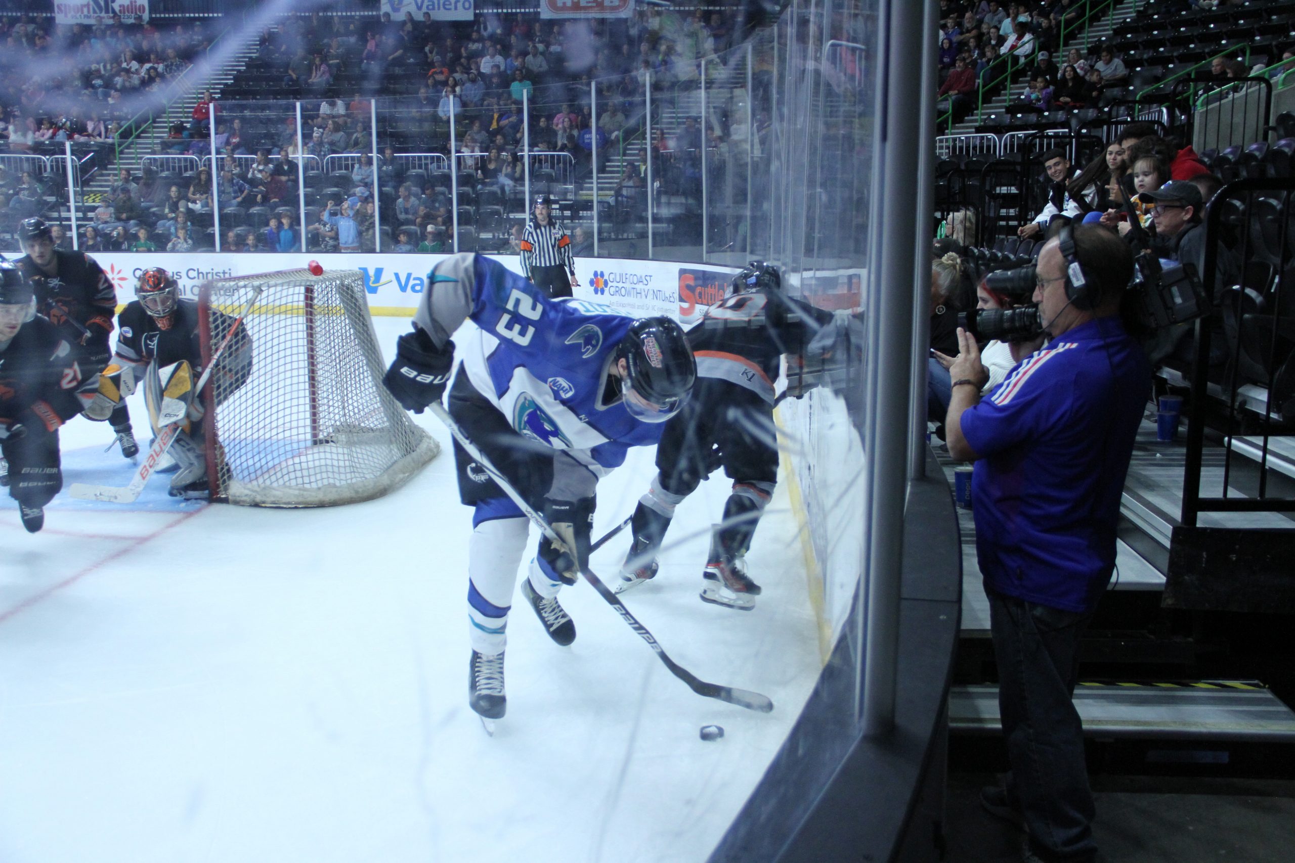
PRESENT: STILL THE ICERAYS
Nothing has particularly changed behind the scenes this time: the team hasn’t changed leagues, nor have they switched owners. They’re still chugging along as the same ol’ IceRays, missing that space in the name as usual. But now they’ve brought back their old look with a few minor tweaks.
If it wasn’t clear enough, I’m a fan of this design. In fact, it’s been a dream of mine to see the ’90s logo back on the ice. And now that it’s returned, it seems as though that dream became a reality. I couldn’t be happier about it! The team looks as solid as ever, and I hope this identity stays around for years to come.
I hope you now see how much the IceRays have been through in their quarter-century of history. From changing leagues, and switching owners, Corpus Christi’s very own hockey team has also been through quite a few wardrobe changes as well.